A referenz documentation about the new eTemplates and the syntax and parameters of the several widgets.
As I already covered this in the Tutorial, I like would suggest to have a look there if your are not familiar with the overal concept.
There are two possibilities now to create an eTemplate:
The eTemplates-Editor can import and export now eTemplates as xml-files. Here is short example showing an eTemplate from the example app in the Tutorial (here are screenshots of the template in the editor and the show-function):
<?xml version="1.0"?>
<overlay>
  <grid id="et_media.edit" template="" lang="" group="" version="" width="100%">
    <columns>
      <column/>
      <column/>
      <column/>
      <column/>
    </columns>
    <rows>
      <row>
        <description options="ib" span="all" value="eTemplates MediaDB" no_lang="1" id="msg"/>
      </row>
      <row>
        <hrule span="all"/>
      </row>
      <row>
        <description span="all"/>
      </row>
      <row>
        <description value="Name"/>
        <textbox size="100" maxlength="100" span="all" id="name" statustext="here goes the name of the publication / record"/>
      </row>
      <row>
        <description value="Author"/>
        <textbox size="100" maxlength="100" span="all" id="author" statustext="please use Name, First Name"/>
      </row>
      <row>
        <description value="Type"/>
        <menulist span="all" statustext="select the type fitting most">
          <menupopup id="type"/>
        </menulist>
      </row>
      <row>
        <description value="Description"/>
        <textbox ="" cols="3" rows="100" span="all" id="descr" statustext="we have a fulltext search using that description"/>
      </row>
      <row>
        <description span="all"/>
      </row>
      <row>
        <button label="Read" id="read" statustext="reads or searches for entries matching the criteria above"/>
        <button label="Save" id="save" statustext="saves the change to the db"/>
        <button label="Cancel" id="cancel" statustext="clears the form, without changing anything"/>
        <button label="Delete" id="delete" statustext="deletes an entry"/>
      </row>
    </rows>
  </grid>
</overlay>
The tags / widget-names and attributes / parameters used are as close as possible to XUL. For more information about XUL refer to www.xulplanet.com or the Mozilla docs www.mozilla.org/xpfe/xulref/.
Please keep in mind that the xml-files used to store the eTemplates are only similar to XUL and implement only a subset of XUL. Here are the main differences:
Like XUL the eTemplate-xml-files are quite strict with the xml-syntax:
| Name in Editor | xml attr | xul | internal name | description of the attribut | ||||||||||||
|---|---|---|---|---|---|---|---|---|---|---|---|---|---|---|---|---|
| Type | type (only for sub-types) |
no | type |
The type of the widget is stored in the tag itself, some widgets have sub-types (unknow to XUL).
In that case the subtype is stored in the type attribut. The Type / tag has to be either the name of a standard eTemplate-widget or of an already existing extension. |
||||||||||||
| Name | id | yes | name |
A string to locate the content for the widget in the content array (index) to show the dialog
and for the returned content.
Can be left blank or be obmitted as xml-attribut if the widget needs no content.
The name can contain the following variables, which gets expanded before they are used as
array index (for an example see the Tutorial):
|
||||||||||||
| Label | label | no | label | Displayed in front of each widget (if not empty) or the widget is replacing a '%s' in the label itself. Eg. '%s Name' to have the label Name behind a checkbox. If the label starts with a '@' it is replaced by the value of the content-array at this index (with the '@'-removed). | ||||||||||||
| Help | statustext | yes | help | This text / help-message is displayed in the status-bar of the browser when the widget gets focus (or as tooltip for buttons or general in gtk). If the user has JavaScript switched off, the help-texts get NOT submitted, as this is detected. If the helptext starts with a '@' it is replaced by the value of the content-array at this index (with the '@'-removed). | ||||||||||||
| Options | ? | ? | size | This attribute controls certain aspects of the different widgets. It's meaning and xml / xul-values are document with the widgets. | ||||||||||||
| NoTranslation | no_lang | no | no_lang |
If checked the content of the widget gets NOT translated. The label of a widget get always translated. |
||||||||||||
| needed | needed | no | needed |
If checked (xml-attr: needed="1") the etemplates will reprompt the user if he left
the widget / field empty. This is not yet implemented, but should be filled if applicable. |
||||||||||||
| Readonly | readonly | yes | readonly | If checked (xml-attr: readonly="true") the widget will NOT be editable. If it is not supported by the browser, the etemplate-class makes shure that no changes / content is transmitted back to the app. Only applicable to widgets with input capabilities. Readonly Buttons get removed from the dialog, like they where disabled. The readonly attribute could be set on runtime via a readonly-array sublied to the exec or show function of the class, the value on index=name/id has to be true to make a widget readonly. | ||||||||||||
| Disabled | disabled | yes | disabled | If checked (xml-attr: disabled="true") the widget will NOT be shown. For buttons this could be archived on runtime via setting them readonly. | ||||||||||||
| onChange | onchange | ? | onchange | If checked (xml-attr: onchange="1") and the contet of the widget is changed by the user, the form will be submitted. Via xml or by a program other values can be set (not in the editor at the moment and this is not compatible with the phpGTK implementation of the eTemplates). | ||||||||||||
| Span, Class | span class |
span: no class: yes |
span |
In the editor and internaly this field contains two comma-separated values: span: how many cell a widget should span (default is one), the special value of 'all' can be used to indicate it should span all remaining cells of a row. This is not supported by xul-grid's at the moment, but is planned to be. class: the CSS class for the widget. |
||||||||||||
| Align | align | yes | align | Can be set to 'left' (default), 'center' or 'right'. | ||||||||||||
| Width column-attr. |
width | yes | row[0][#] | Can be set to a percentage (eg. '10%'), a number of pixels or ... | ||||||||||||
| Height row-attr. |
height | yes | row[0][h#] | Can be set to a percentage (eg. '10%'), a number of pixels or ... | ||||||||||||
| Class, Valign row-attr. |
class valign |
both: yes | row[0][c#] |
In the editor and internaly this field contains two comma-separated values: class: the CSS class for the row, there are 4 predefined css-classes: nmh: next-match-header-background, nmr: alternating next-match-row-background which gets replaced by the etemplate class with nmr0 or nmr1. valign: vertical alignment of the widgets in the row: 'top', 'middle' (default) or 'bottom' |
| Widget Name in Editor | xml tag | xul | internal name | description of the widget | |
|---|---|---|---|---|---|
| Label | <description/> | yes | label |
a textual label The content is taken from the content-array but it can have an own label from the label attribute too. Options: if it contains a 'i' and/or a 'b' the content (not the label) is rendered in italic and/or bold. |
|
| Text | <textbox/> | yes | text |
a single-line input field for text In the html-UI this is rendered as <input ...>
Options has 2 comma-separated fields: |
|
| Integer | <textbox type="integer"/> |
? | integer |
a input-field to enter an integer In the html-UI this is rendered as <input ...>. There are no checks implemented at the moment, but the will come in the near future.
Options has 3 comma-separated fields: |
|
| Float | <textbox type="float"/> |
? | float |
a input-field to enter a float In the html-UI this is rendered as <input ...>. There are no checks implemented at the moment, but the will come in the near future.
Options has 3 comma-separated fields: |
|
| Textarea | <textbox multiline="true"/> |
yes | textarea |
a multiline input-field for text In the html-UI this is rendered as <textarea ...>.
Options has 2 comma-separated fields: |
|
| Checkbox | <checkbox/> | yes | checkbox |
a widget that can be checked or unchecked In the html-UI this is rendered as <input type="checkbox" ...>. |
|
| Radiobutton | <radio/> | ? | radio |
a widget in a group of which only one can be checked In the html-UI this is rendered as <input type="radio" ...> Unlike XUL (and like html) the radio-buttons are grouped by giving them the same name / id. If it is checked, the value is set to what is entered in Options. If the value of the content array at index name/id matches the options-field the radiobutton is marked 'checked'. |
|
| Submitbutton | <button image="img.gif" ro_image="img-grey.gif"/> | yes | button |
a button to submit the form / end the dialog In the html-UI this is rendered as <input type="submit" ...>. If a button is set readonly (via seting its id in the $readonlys array passed to exec) it is not rendered at all (if no ro_image is given), like it would be diabled.
onChange xml: onchange: if set and the user has JavaScript enabled
the button is renderd as a link around the label and a hidden
input to set id if the link is clicked. |
|
| Horizonatal Rule | <hrule/> | no | hrule |
a horizontal rule / line In the html-UI this is rendered as <hr ...> Options can contain a width of the rule, default is 100% |
|
| Template | <grid/> | yes | template |
a separate eTemplate to be loaded into this cell Name xml: id: the name of the etemplate to load Options xml: content: if set, the template uses an own sub-array of the content array indexed by the value of this field (if not the full content-array is used). Variables like $row can be used as descript for the general attribute Name. |
|
| Image | <image/> | yes | image |
shows an image Label xml: src: the name of the image to load, the image is search in the apps template-dirs Name xml: id: if set, a link to that methode = app.class.method is put around the image |
|
| Selectbox |
<menulist> <menupopup/> </menulist>
multiselect: options > 1 |
yes | select |
shows a selectbox The content of the selectbox / the options have to be in an array which can be in 2 locations:
xml: rows: only for <listbox>: number of rows to show
xml: type: can be set to get several predefined select-contents, in that case you dont need to set
the content as descripted above: | |
| Tabs |
<tabbox> <tabs> <tab/> </tabs> <tabpanels> <grid/> </tabpanels> </tabbox> |
yes | tab |
shows a tab-widget The tab-widget is implemented as an extension, as html does not have a tab-widget.
The following fields / attributes are in the Editor and internaly in the class separeted by '|', in the
xml/xul-file the are attributes of each tab- or grid-tag: |
The eTemplates have an interface to extend them with new widgets. These widgets are php-classes, can use eTemplates to define the UI of the new widget and are stored in the eTemplate's inc-dir or the inc-dir of a phpGroupWare application. The editor and the etemplate-class autoload the existing extensions.
I will made more documentation about the interface availible soon.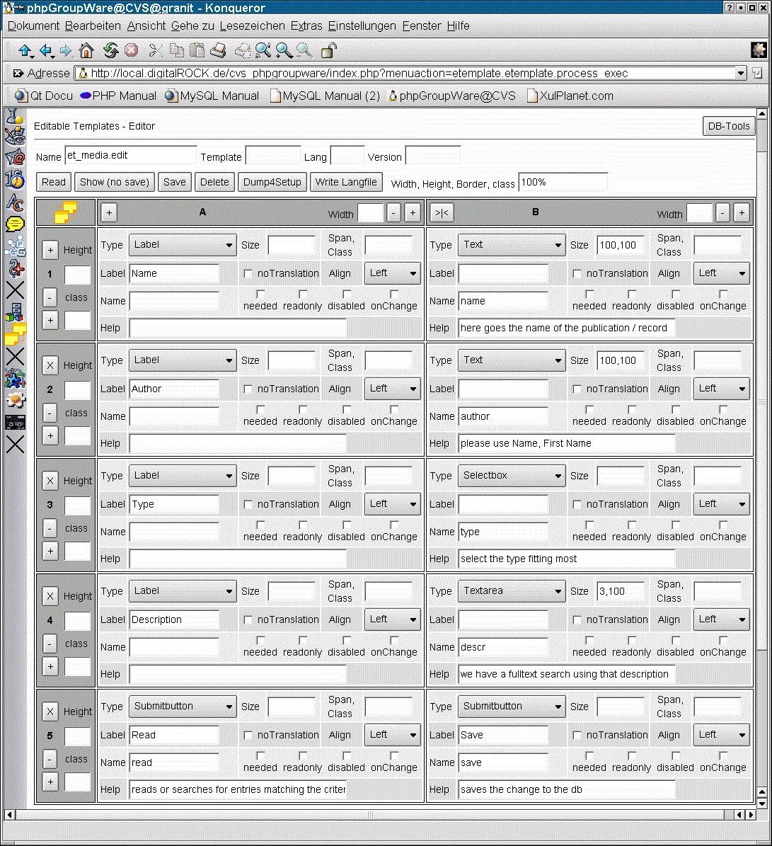