mirror of
https://github.com/PaddiM8/kalker.git
synced 2024-12-14 02:20:57 +01:00
| .. | ||
| public | ||
| src | ||
| .gitignore | ||
| package-lock.json | ||
| package.json | ||
| preview.png | ||
| README.md | ||
| tsconfig.json | ||
| webpack.config.ts | ||
Kalk Web Component
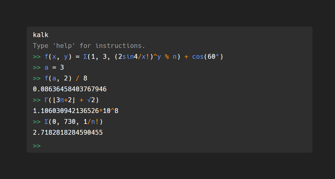
A web component built with Svelte that uses kalk (WebAssembly).
Installation & Setup
npm install --save @paddim8/kalk-component
Module
import { KalkCalculator, ConsoleLine } from "@paddim8/kalk-component"
If your bundler doesn't include all the files in the output folder, you may need to eg. modify your build script to copy them over manually. I am not aware of a better way.
Or only with HTML
<script type="text/javascript" src="some/path/bundle.js"></script>
Usage
<div class="kalk"> <!-- Apply css rules for position/size/font/etc. to this -->
    <kalk-calculator>
        <console-line>kalk</console-line>
        <console-line>
            <span class="hint">Type 'help' for instructions.</span>
        </console-line>
</kalk-calculator>
</div>
Customizing
The colours in the component can be changed by using these attributes.
<kalk-calculator
    hinttext="Type something..."
    autofocus="true"
    identifiercolor="cornflowerblue"
    operatorcolor="darkorange"
    promptcolor="mediumseagreen"
    errorcolor="tomato"
    hintcolor="#9c9c9c"
    linkcolor="cornflowerblue"
    backgroundcolor="#424242" />


