46 KiB
Configuration
Intro
Configuration is done via a single YAML file and a server restart is required in order for any changes to take effect. Trying to start the server with an invalid config file will result in an error.
Preconfigured page
If you don't want to spend time reading through all the available configuration options and just want something to get you going quickly you can use the following glance.yml and make changes as you see fit:
pages:
  - name: Home
    columns:
      - size: small
        widgets:
          - type: calendar

          - type: rss
            limit: 10
            collapse-after: 3
            cache: 3h
            feeds:
              - url: https://ciechanow.ski/atom.xml
              - url: https://www.joshwcomeau.com/rss.xml
                title: Josh Comeau
              - url: https://samwho.dev/rss.xml
              - url: https://awesomekling.github.io/feed.xml
              - url: https://ishadeed.com/feed.xml
                title: Ahmad Shadeed

          - type: twitch-channels
            channels:
              - theprimeagen
              - cohhcarnage
              - christitustech
              - blurbs
              - asmongold
              - jembawls

      - size: full
        widgets:
          - type: hacker-news

          - type: videos
            channels:
              - UCR-DXc1voovS8nhAvccRZhg # Jeff Geerling
              - UCv6J_jJa8GJqFwQNgNrMuww # ServeTheHome
              - UCOk-gHyjcWZNj3Br4oxwh0A # Techno Tim

          - type: reddit
            subreddit: selfhosted

      - size: small
        widgets:
          - type: weather
            location: London, United Kingdom

          - type: markets
            markets:
              - symbol: SPY
                name: S&P 500
              - symbol: BTC-USD
                name: Bitcoin
              - symbol: NVDA
                name: NVIDIA
              - symbol: AAPL
                name: Apple
              - symbol: MSFT
                name: Microsoft
              - symbol: GOOGL
                name: Google
              - symbol: AMD
                name: AMD
              - symbol: RDDT
                name: Reddit
This will give you a page that looks like the following:
Configure the widgets, add more of them, add extra pages, etc. Make it your own!
Server
Server configuration is done through a top level server property. Example:
server:
  port: 8080
  assets-path: /home/user/glance-assets
Properties
| Name | Type | Required | Default |
|---|---|---|---|
| host | string | no | |
| port | number | no | 8080 |
| base-url | string | no | |
| assets-path | string | no |
host
The address which the server will listen on. Setting it to localhost means that only the machine that the server is running on will be able to access the dashboard. By default it will listen on all interfaces.
port
A number between 1 and 65,535, so long as that port isn't already used by anything else.
base-url
The base URL that Glance is hosted under. No need to specify this unless you're using a reverse proxy and are hosting Glance under a directory. If that's the case then you can set this value to /glance or whatever the directory is called. Note that the forward slash (/) in the beginning is required unless you specify the full domain and path.
assets-path
The path to a directory that will be served by the server under the /assets/ path. This is handy for widgets like the Monitor where you have to specify an icon URL and you want to self host all the icons rather than pointing to an external source.
Important
When installing through docker the path will point to the files inside the container. Don't forget to mount your assets path to the same path inside the container. Example:
If your assets are in:
/home/user/glance-assetsYou should mount:
/home/user/glance-assets:/app/assetsAnd your config should contain:
assets-path: /app/assets
Examples
Say you have a directory glance-assets with a file gitea-icon.png in it and you specify your assets path like:
assets-path: /home/user/glance-assets
To be able to point to an asset from your assets path, use the /assets/ path like such:
icon: /assets/gitea-icon.png
Branding
You can adjust the various parts of the branding through a top level branding property. Example:
branding:
  custom-footer: |
    <p>Powered by <a href="https://github.com/glanceapp/glance">Glance</a></p>
  logo-url: /assets/logo.png
  favicon-url: /assets/logo.png
Properties
| Name | Type | Required | Default |
|---|---|---|---|
| hide-footer | bool | no | false |
| custom-footer | string | no | |
| logo-text | string | no | G |
| logo-url | string | no | |
| favicon-url | string | no |
hide-footer
Hides the footer when set to true.
custom-footer
Specify custom HTML to use for the footer.
logo-text
Specify custom text to use instead of the "G" found in the navigation.
logo-url
Specify a URL to a custom image to use instead of the "G" found in the navigation. If both logo-text and logo-url are set, only logo-url will be used.
favicon-url
Specify a URL to a custom image to use for the favicon.
Theme
Theming is done through a top level theme property. Values for the colors are in HSL (hue, saturation, lightness) format. You can use a color picker like this one to convert colors from other formats to HSL. The values are separated by a space and % is not required for any of the numbers.
Example:
theme:
  background-color: 100 20 10
  primary-color: 40 90 40
  contrast-multiplier: 1.1
Themes
If you don't want to spend time configuring your own theme, there are several available themes which you can simply copy the values for.
Properties
| Name | Type | Required | Default |
|---|---|---|---|
| light | boolean | no | false |
| background-color | HSL | no | 240 8 9 |
| primary-color | HSL | no | 43 50 70 |
| positive-color | HSL | no | same as primary-color |
| negative-color | HSL | no | 0 70 70 |
| contrast-multiplier | number | no | 1 |
| text-saturation-multiplier | number | no | 1 |
| custom-css-file | string | no |
light
Whether the scheme is light or dark. This does not change the background color, it inverts the text colors so that they look appropriately on a light background.
background-color
Color of the page and widgets.
primary-color
Color used across the page, largely to indicate unvisited links.
positive-color
Used to indicate that something is positive, such as stock price being up, twitch channel being live or a monitored site being online. If not set, the value of primary-color will be used.
negative-color
Oppposite of positive-color.
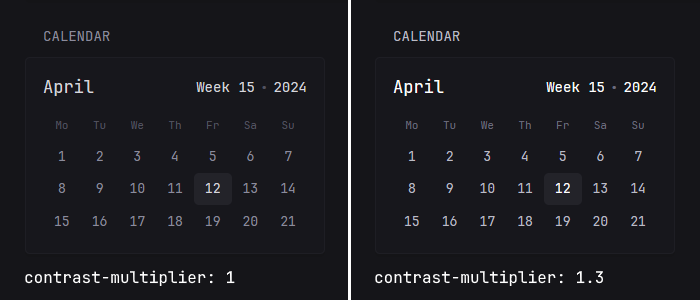
contrast-multiplier
Used to increase or decrease the contrast (in other words visibility) of the text. A value of 1.3 means that the text will be 30% lighter/darker depending on the scheme. Use this if you think that some of the text on the page is too dark and hard to read. Example:
text-saturation-multiplier
Used to increase or decrease the saturation of text, useful when using a custom background color with a high amount of saturation and needing the text to have a more neutral color. 0.5 means that the saturation will be 50% lower and 1.5 means that it'll be 50% higher.
custom-css-file
Path to a custom CSS file, either external or one from within the server configured assets path. Example:
theme:
  custom-css-file: /assets/my-style.css
Tip
Because Glance uses a lot of utility classes it might be difficult to target some elements. To make it easier to style specific widgets, each widget has a
widget-type-{name}class, so for example if you wanted to make the links inside just the RSS widget bigger you could use the following selector:.widget-type-rss a { font-size: 1.5rem; } In addition, you can also use the `css-class` property which is available on every widget to set custom class names for individual widgets.
Pages & Columns
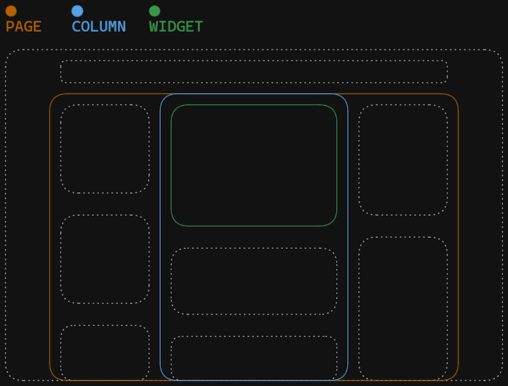
Using pages and columns is how widgets are organized. Each page contains up to 3 columns and each column can have any number of widgets.
Pages
Pages are defined through a top level pages property. The page defined first becomes the home page and all pages get automatically added to the navigation bar in the order that they were defined. Example:
pages:
  - name: Home
    columns: ...

  - name: Videos
    columns: ...

  - name: Homelab
    columns: ...
Properties
| Name | Type | Required | Default |
|---|---|---|---|
| title | string | yes | |
| slug | string | no | |
| width | string | no | |
| hide-desktop-navigation | boolean | no | false |
| show-mobile-header | boolean | no | false |
| columns | array | yes |
title
The name of the page which gets shown in the navigation bar.
slug
The URL friendly version of the title which is used to access the page. For example if the title of the page is "RSS Feeds" you can make the page accessible via localhost:8080/feeds by setting the slug to feeds. If not defined, it will automatically be generated from the title.
width
The maximum width of the page on desktop. Possible values are slim and wide.
- default:
1600px - slim:
1100px - wide:
1920px
Note
When using
slim, the maximum number of columns allowed for that page is2.
hide-desktop-navigation
Whether to show the navigation links at the top of the page on desktop.
show-mobile-header
Whether to show a header displaying the name of the page on mobile. The header purposefully has a lot of vertical whitespace in order to push the content down and make it easier to reach on tall devices.
Preview:
Columns
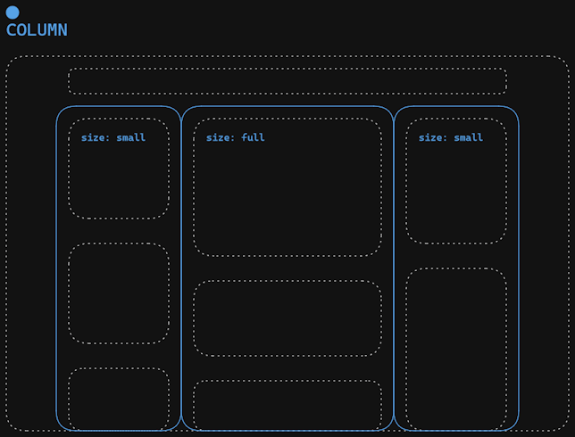
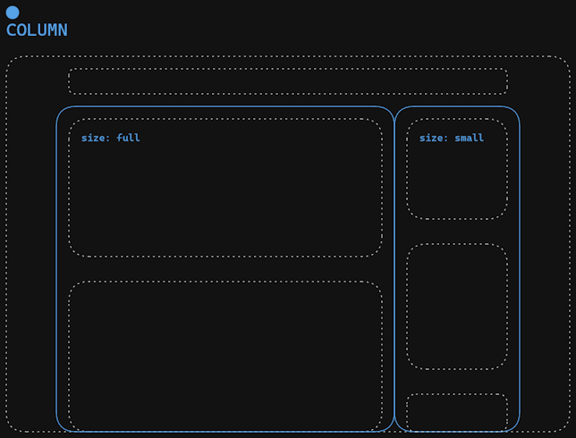
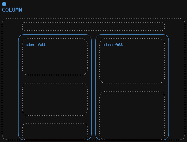
Columns are defined for each page using a columns property. There are two types of columns - full and small, which refers to their width. A small column takes up a fixed amount of width (300px) and a full column takes up the all of the remaining width. You can have up to 3 columns per page and you must have either 1 or 2 full columns. Example:
pages:
  - name: Home
    columns:
      - size: small
        widgets: ...
      - size: full
        widgets: ...
      - size: small
        widgets: ...
Properties
| Name | Type | Required |
|---|---|---|
| size | string | yes |
| widgets | array | no |
Here are some of the possible column configurations:
columns:
  - size: small
    widgets: ...
  - size: full
    widgets: ...
  - size: small
    widgets: ...
columns:
  - size: full
    widgets: ...
  - size: small
    widgets: ...
columns:
  - size: full
    widgets: ...
  - size: full
    widgets: ...
Widgets
Widgets are defined for each column using a widgets property. Example:
pages:
  - name: Home
    columns:
      - size: small
        widgets:
          - type: weather
            location: London, United Kingdom
Note
Currently not all widgets are designed to fit every column size, however some widgets offer different "styles" that help alleviate this limitation.
Shared Properties
| Name | Type | Required |
|---|---|---|
| type | string | yes |
| title | string | no |
| title-url | string | no |
| cache | string | no |
| css-class | string | no |
type
Used to specify the widget.
title
The title of the widget. If left blank it will be defined by the widget.
title-url
The URL to go to when clicking on the widget's title. If left blank it will be defined by the widget (if available).
cache
How long to keep the fetched data in memory. The value is a string and must be a number followed by one of s, m, h, d. Examples:
cache: 30s # 30 seconds
cache: 5m  # 5 minutes
cache: 2h  # 2 hours
cache: 1d  # 1 day
Note
Not all widgets can have their cache duration modified. The calendar and weather widgets update on the hour and this cannot be changed.
css-class
Set custom CSS classes for the specific widget instance.
RSS
Display a list of articles from multiple RSS feeds.
Example:
- type: rss
  title: News
  style: horizontal-cards
  feeds:
    - url: https://feeds.bloomberg.com/markets/news.rss
      title: Bloomberg
    - url: https://moxie.foxbusiness.com/google-publisher/markets.xml
      title: Fox Business
    - url: https://moxie.foxbusiness.com/google-publisher/technology.xml
      title: Fox Business
Properties
| Name | Type | Required | Default |
|---|---|---|---|
| style | string | no | vertical-list |
| feeds | array | yes | |
| thumbnail-height | float | no | 10 |
| card-height | float | no | 27 |
| limit | integer | no | 25 |
| collapse-after | integer | no | 5 |
style
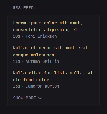
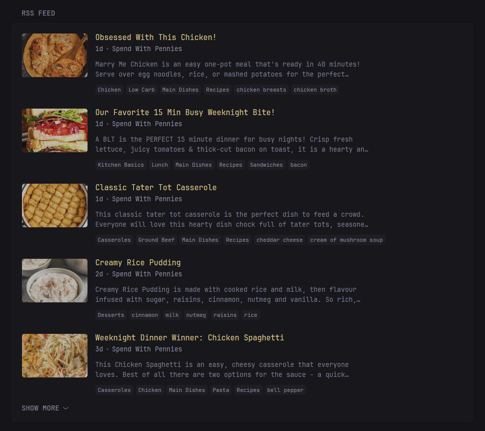
Used to change the appearance of the widget. Possible values are vertical-list and horizontal-cards where the former is intended to be used within a small column and the latter a full column. Below are previews of each style.
vertical-list
detailed-list
horizontal-cards
horizontal-cards-2
thumbnail-height
Used to modify the height of the thumbnails. Works only when the style is set to horizontal-cards. The default value is 10 and the units are rem, if you want to for example double the height of the thumbnails you can set it to 20.
card-height
Used to modify the height of cards when using the horizontal-cards-2 style. The default value is 27 and the units are rem.
feeds
An array of RSS/atom feeds. The title can optionally be changed.
Properties for each feed
| Name | Type | Required | Default | Notes |
|---|---|---|---|---|
| url | string | yes | ||
| title | string | no | the title provided by the feed | |
| hide-categories | boolean | no | false | Only applicable for detailed-list style |
| hide-description | boolean | no | false | Only applicable for detailed-list style |
| item-link-prefix | string | no |
item-link-prefix
If an RSS feed isn't returning item links with a base domain and Glance has failed to automatically detect the correct domain you can manually add a prefix to each link with this property.
limit
The maximum number of articles to show.
collapse-after
How many articles are visible before the "SHOW MORE" button appears. Set to -1 to never collapse.
Videos
Display a list of the latest videos from specific YouTube channels.
Example:
- type: videos
  channels:
    - UCXuqSBlHAE6Xw-yeJA0Tunw
    - UCBJycsmduvYEL83R_U4JriQ
    - UCHnyfMqiRRG1u-2MsSQLbXA
Properties
| Name | Type | Required | Default |
|---|---|---|---|
| channels | array | yes | |
| limit | integer | no | 25 |
| style | string | no | horizontal-cards |
| collapse-after-rows | integer | no | 4 |
| include-shorts | boolean | no | false |
| video-url-template | string | no | https://www.youtube.com/watch?v={VIDEO-ID} |
channels
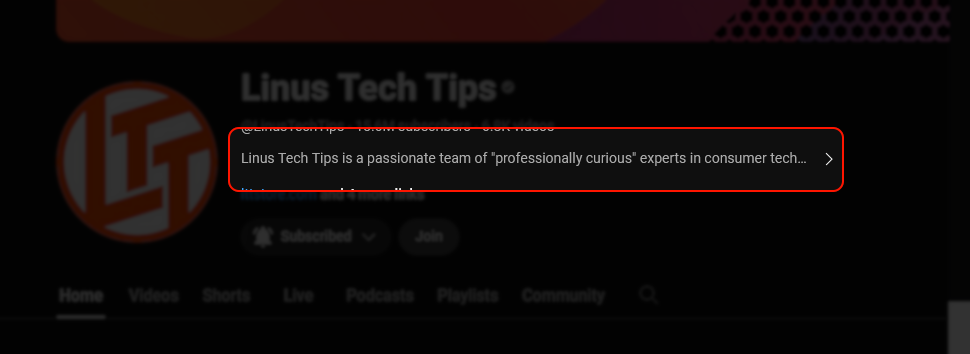
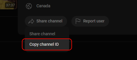
A list of channel IDs. One way of getting the ID of a channel is going to the channel's page and clicking on its description:
Then scroll down and click on "Share channel", then "Copy channel ID":
limit
The maximum number of videos to show.
collapse-after-rows
Specify the number of rows to show when using the grid-cards style before the "SHOW MORE" button appears.
style
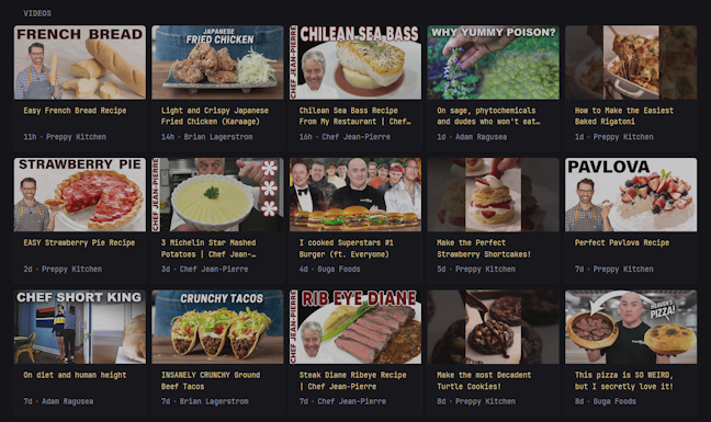
Used to change the appearance of the widget. Possible values are horizontal-cards and grid-cards.
Preview of grid-cards:
video-url-template
Used to replace the default link for videos. Useful when you're running your own YouTube front-end. Example:
video-url-template: https://invidious.your-domain.com/watch?v={VIDEO-ID}
Placeholders:
{VIDEO-ID} - the ID of the video
Hacker News
Display a list of posts from Hacker News.
Example:
- type: hacker-news
  limit: 15
  collapse-after: 5
Properties
| Name | Type | Required | Default |
|---|---|---|---|
| limit | integer | no | 15 |
| collapse-after | integer | no | 5 |
| comments-url-template | string | no | https://news.ycombinator.com/item?id={POST-ID} |
| sort-by | string | no | top |
| extra-sort-by | string | no |
comments-url-template
Used to replace the default link for post comments. Useful if you want to use an alternative front-end. Example:
comments-url-template: https://www.hckrnws.com/stories/{POST-ID}
Placeholders:
{POST-ID} - the ID of the post
sort-by
Used to specify the order in which the posts should get returned. Possible values are top, new, and best.
extra-sort-by
Can be used to specify an additional sort which will be applied on top of the already sorted posts. By default does not apply any extra sorting and the only available option is engagement.
The engagement sort tries to place the posts with the most points and comments on top, also prioritizing recent over old posts.
Lobsters
Display a list of posts from Lobsters.
Example:
- type: lobsters
  sort-by: hot
  tags:
    - go
    - security
    - linux
  limit: 15
  collapse-after: 5
Properties
| Name | Type | Required | Default |
|---|---|---|---|
| instance-url | string | no | https://lobste.rs/ |
| custom-url | string | no | |
| limit | integer | no | 15 |
| collapse-after | integer | no | 5 |
| sort-by | string | no | hot |
| tags | array | no |
instance-url
The base URL for a lobsters instance hosted somewhere other than on lobste.rs. Example:
instance-url: https://www.journalduhacker.net/
custom-url
A custom URL to retrieve lobsters posts from. If this is specified, the instance-url, sort-by and tags properties are ignored.
limit
The maximum number of posts to show.
collapse-after
How many posts are visible before the "SHOW MORE" button appears. Set to -1 to never collapse.
sort-by
The sort order in which posts are returned. Possible options are hot and new.
tags
Limit to posts containing one of the given tags. You cannot specify a sort order when filtering by tags, it will default to hot.
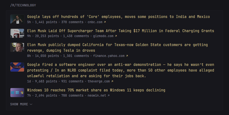
Display a list of posts from a specific subreddit.
Warning
Reddit does not allow unauthorized API access from VPS IPs, if you're hosting Glance on a VPS you will get a 403 response. As a workaround you can route the traffic from Glance through a VPN or your own HTTP proxy using the
request-url-templateproperty.
Example:
- type: reddit
  subreddit: technology
Properties
| Name | Type | Required | Default |
|---|---|---|---|
| subreddit | string | yes | |
| style | string | no | vertical-list |
| show-thumbnails | boolean | no | false |
| show-flairs | boolean | no | false |
| limit | integer | no | 15 |
| collapse-after | integer | no | 5 |
| comments-url-template | string | no | https://www.reddit.com/{POST-PATH} |
| request-url-template | string | no | |
| sort-by | string | no | hot |
| top-period | string | no | day |
| search | string | no | |
| extra-sort-by | string | no |
subreddit
The subreddit for which to fetch the posts from.
style
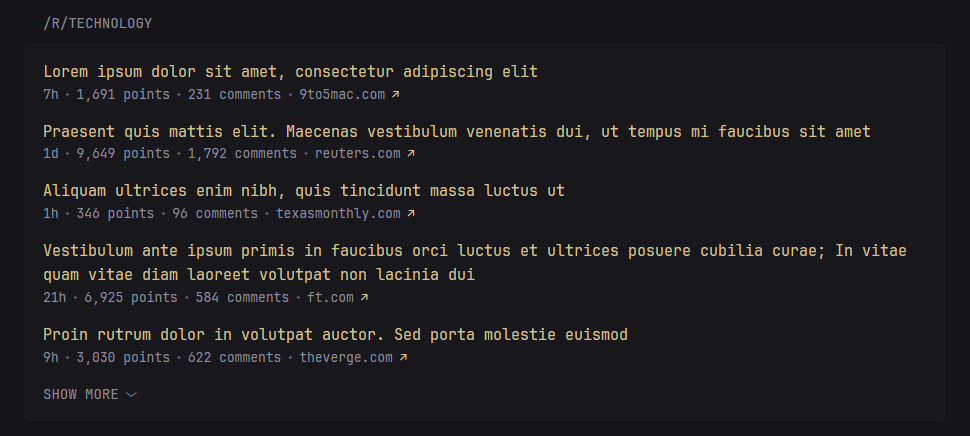
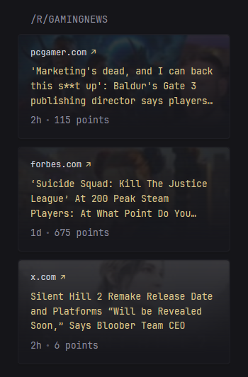
Used to change the appearance of the widget. Possible values are vertical-list, horizontal-cards and vertical-cards. The first two were designed for full columns and the last for small columns.
vertical-list
horizontal-cards
vertical-cards
show-thumbnails
Shows or hides thumbnails next to the post. This only works if the style is vertical-list. Preview:
Note
Thumbnails don't work for some subreddits due to Reddit's API not returning the thumbnail URL. No workaround for this yet.
show-flairs
Shows post flairs when set to true.
limit
The maximum number of posts to show.
collapse-after
How many posts are visible before the "SHOW MORE" button appears. Set to -1 to never collapse. Not available when using the vertical-cards and horizontal-cards styles.
comments-url-template
Used to replace the default link for post comments. Useful if you want to use the old Reddit design or any other 3rd party front-end. Example:
comments-url-template: https://old.reddit.com/{POST-PATH}
Placeholders:
{POST-PATH} - the full path to the post, such as:
r/selfhosted/comments/bsp01i/welcome_to_rselfhosted_please_read_this_first/
{POST-ID} - the ID that comes after /comments/
{SUBREDDIT} - the subreddit name
request-url-template
A custom request url that will be used to fetch the data instead. This is useful when you're hosting Glance on a VPS and Reddit is blocking the requests, and you want to route it through an HTTP proxy.
Placeholders:
{REQUEST-URL} - will be templated and replaced with the expanded request URL (i.e. https://www.reddit.com/r/selfhosted/hot.json). Example:
https://proxy/{REQUEST-URL}
https://your.proxy/?url={REQUEST-URL}
sort-by
Can be used to specify the order in which the posts should get returned. Possible values are hot, new, top and rising.
top-period
Available only when sort-by is set to top. Possible values are hour, day, week, month, year and all.
search
Keywords to search for. Searching within specific fields is also possible, though keep in mind that Reddit may remove the ability to use any of these at any time:
extra-sort-by
Can be used to specify an additional sort which will be applied on top of the already sorted posts. By default does not apply any extra sorting and the only available option is engagement.
The engagement sort tries to place the posts with the most points and comments on top, also prioritizing recent over old posts.
Search Widget
Display a search bar that can be used to search for specific terms on various search engines.
Example:
- type: search
  search-engine: duckduckgo
  bangs:
    - title: YouTube
      shortcut: "!yt"
      url: https://www.youtube.com/results?search_query={QUERY}
Preview:
Keyboard shortcuts
| Keys | Action | Condition |
|---|---|---|
| S | Focus the search bar | Not already focused on another input field |
| Enter | Perform search in the same tab | Search input is focused and not empty |
| Ctrl + Enter | Perform search in a new tab | Search input is focused and not empty |
| Escape | Leave focus | Search input is focused |
Tip
You can use the property
new-tabwith a value oftrueif you want to show search results in a new tab by default. Ctrl + Enter will then show results in the same tab.
Properties
| Name | Type | Required | Default |
|---|---|---|---|
| search-engine | string | no | duckduckgo |
| new-tab | boolean | no | false |
| autofocus | boolean | no | false |
| bangs | array | no |
search-engine
Either a value from the table below or a URL to a custom search engine. Use {QUERY} to indicate where the query value gets placed.
| Name | URL |
|---|---|
| duckduckgo | https://duckduckgo.com/?q={QUERY} |
https://www.google.com/search?q={QUERY} |
new-tab
When set to true, swaps the shortcuts for showing results in the same or new tab, defaulting to showing results in a new tab.
new-tab
When set to true, automatically focuses the search input on page load.
bangs
What now? Bangs. They're shortcuts that allow you to use the same search box for many different sites. Assuming you have it configured, if for example you start your search input with !yt you'd be able to perform a search on YouTube:
Properties for each bang
| Name | Type | Required |
|---|---|---|
| title | string | no |
| shortcut | string | yes |
| url | string | yes |
title
Optional title that will appear on the right side of the search bar when the query starts with the associated shortcut.
shortcut
Any value you wish to use as the shortcut for the search engine. It does not have to start with !.
Important
In YAML some characters have special meaning when placed in the beginning of a value. If your shortcut starts with
!(and potentially some other special characters) you'll have to wrap the value in quotes:shortcut: "!yt"
url
The URL of the search engine. Use {QUERY} to indicate where the query value gets placed. Examples:
url: https://www.reddit.com/search?q={QUERY}
url: https://store.steampowered.com/search/?term={QUERY}
url: https://www.amazon.com/s?k={QUERY}
Group
Group multiple widgets into one using tabs. Widgets are defined using a widgets property exactly as you would on a page column. The only limitation is that you cannot place a group widget within a group widget.
Example:
- type: group
  widgets:
    - type: reddit
      subreddit: gamingnews
      show-thumbnails: true
      collapse-after: 6
    - type: reddit
      subreddit: games
    - type: reddit
      subreddit: pcgaming
      show-thumbnails: true
Preview:
Sharing properties
To avoid repetition you can use YAML anchors and share properties between widgets.
Example:
- type: group
  define: &shared-properties
      type: reddit
      show-thumbnails: true
      collapse-after: 6
  widgets:
    - subreddit: gamingnews
      <<: *shared-properties
    - subreddit: games
      <<: *shared-properties
    - subreddit: pcgaming
      <<: *shared-properties
Extension
Display a widget provided by an external source (3rd party). If you want to learn more about developing extensions, checkout the extensions documentation (WIP).
- type: extension
  url: https://domain.com/widget/display-a-message
  allow-potentially-dangerous-html: true
  parameters:
    message: Hello, world!
Properties
| Name | Type | Required | Default |
|---|---|---|---|
| url | string | yes | |
| allow-potentially-dangerous-html | boolean | no | false |
| parameters | key & value | no |
url
The URL of the extension.
allow-potentially-dangerous-html
Whether to allow the extension to display HTML.
Warning
There's a reason this property is scary-sounding. It's intended to be used by developers who are comfortable with developing and using their own extensions. Do not enable it if you have no idea what it means or if you're not absolutely sure that the extension URL you're using is safe.
parameters
A list of keys and values that will be sent to the extension as query paramters.
Weather
Display weather information for a specific location. The data is provided by https://open-meteo.com/.
Example:
- type: weather
  units: metric
  hour-format: 12h
  location: London, United Kingdom
Note
US cities which have common names can have their state specified as the second parameter as such:
- Greenville, North Carolina, United States
- Greenville, South Carolina, United States
- Greenville, Mississippi, United States
Preview:
Each bar represents a 2 hour interval. The yellow background represents sunrise and sunset. The blue dots represent the times of the day where there is a high chance for precipitation. You can hover over the bars to view the exact temperature for that time.
Properties
| Name | Type | Required | Default |
|---|---|---|---|
| location | string | yes | |
| units | string | no | metric |
| hour-format | string | no | 12h |
| hide-location | boolean | no | false |
| show-area-name | boolean | no | false |
location
The name of the city and country to fetch weather information for. Attempting to launch the applcation with an invalid location will result in an error. You can use the gecoding API page to search for your specific location. Glance will use the first result from the list if there are multiple.
units
Whether to show the temperature in celsius or fahrenheit, possible values are metric or imperial.
hour-format
Whether to show the hours of the day in 12-hour format or 24-hour format. Possible values are 12h and 24h.
hide-location
Optionally don't display the location name on the widget.
show-area-name
Whether to display the state/administrative area in the location name. If set to true the location will be displayed as:
Greenville, North Carolina, United States
Otherwise, if set to false (which is the default) it'll be displayed as:
Greenville, United States
Monitor
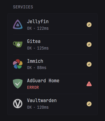
Display a list of sites and whether they are reachable (online) or not. This is determined by sending a GET request to the specified URL, if the response is 200 then the site is OK. The time it took to receive a response is also shown in milliseconds.
Example:
- type: monitor
  cache: 1m
  title: Services
  sites:
    - title: Jellyfin
      url: https://jellyfin.yourdomain.com
      icon: /assets/jellyfin-logo.png
    - title: Gitea
      url: https://gitea.yourdomain.com
      icon: /assets/gitea-logo.png
    - title: Immich
      url: https://immich.yourdomain.com
      icon: /assets/immich-logo.png
    - title: AdGuard Home
      url: https://adguard.yourdomain.com
      icon: /assets/adguard-logo.png
    - title: Vaultwarden
      url: https://vault.yourdomain.com
      icon: /assets/vaultwarden-logo.png
Preview:
You can hover over the "ERROR" text to view more information.
Properties
| Name | Type | Required | Default |
|---|---|---|---|
| sites | array | yes | |
| show-failing-only | boolean | no | false |
| style | string | no |
style
To make the widget scale appropriately in a full size column, set the style to the experimental dynamic-columns-experimental option.
show-failing-only
Shows only a list of failing sites when set to true.
sites
Properties for each site:
| Name | Type | Required | Default |
|---|---|---|---|
| title | string | yes | |
| url | string | yes | |
| check-url | string | no | |
| icon | string | no | |
| allow-insecure | boolean | no | false |
| same-tab | boolean | no | false |
title
The title used to indicate the site.
url
The public facing URL of a monitored service, the user will be redirected here. If check-url is not specified, this is used as the status check.
check-url
The URL which will be requested and its response will determine the status of the site. If not specified, the url property is used.
icon
Optional URL to an image which will be used as the icon for the site. Can be an external URL or internal via server configured assets. You can also directly use Simple Icons via a si: prefix:
icon: si:jellyfin
icon: si:gitea
icon: si:adguard
Warning
Simple Icons are loaded externally and are hosted on
cdnjs.cloudflare.com, if you do not wish to depend on a 3rd party you are free to download the icons individually and host them locally.
allow-insecure
Whether to ignore invalid/self-signed certificates.
same-tab
Whether to open the link in the same or a new tab.
Releases
Display a list of latest releases for specific repositories on Github, GitLab or Docker Hub.
Example:
- type: releases
  show-source-icon: true
  repositories:
    - go-gitea/gitea
    - jellyfin/jellyfin
    - glanceapp/glance
    - gitlab:fdroid/fdroidclient
    - dockerhub:gotify/server
Preview:
Properties
| Name | Type | Required | Default |
|---|---|---|---|
| repositories | array | yes | |
| show-source-icon | boolean | no | false |
| token | string | no | |
| gitlab-token | string | no | |
| limit | integer | no | 10 |
| collapse-after | integer | no | 5 |
repositories
A list of repositores to fetch the latest release for. Only the name/repo is required, not the full URL. A prefix can be specified for repositories hosted elsewhere such as GitLab and Docker Hub. Example:
repositories:
  - gitlab:inkscape/inkscape
  - dockerhub:glanceapp/glance
Official images on Docker Hub can be specified by ommiting the owner:
repositories:
  - dockerhub:nginx
  - dockerhub:node
  - dockerhub:alpine
You can also specify specific tags for Docker Hub images:
repositories:
  - dockerhub:nginx:latest
  - dockerhub:nginx:stable-alpine
show-source-icon
Shows an icon of the source (GitHub/GitLab/Docker Hub) next to the repository name when set to true.
token
Without authentication Github allows for up to 60 requests per hour. You can easily exceed this limit and start seeing errors if you're tracking lots of repositories or your cache time is low. To circumvent this you can create a read only token from your Github account and provide it here.
You can also specify the value for this token through an ENV variable using the syntax ${GITHUB_TOKEN} where GITHUB_TOKEN is the name of the variable that holds the token. If you've installed Glance through docker you can specify the token in your docker-compose:
services:
  glance:
    image: glanceapp/glance
    environment:
      - GITHUB_TOKEN: <your token>
and then use it in your glance.yml like this:
- type: releases
  token: ${GITHUB_TOKEN}
  repositories: ...
This way you can safely check your glance.yml in version control without exposing the token.
gitlab-token
Same as the above but used when fetching GitLab releases.
limit
The maximum number of releases to show.
collapse-after
How many releases are visible before the "SHOW MORE" button appears. Set to -1 to never collapse.
Repository
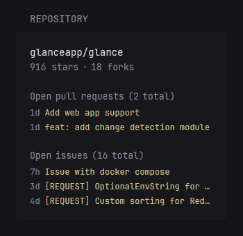
Display general information about a repository as well as a list of the latest open pull requests and issues.
Example:
- type: repository
  repository: glanceapp/glance
  pull-requests-limit: 5
  issues-limit: 3
  commits-limit: 3
Preview:
Properties
| Name | Type | Required | Default |
|---|---|---|---|
| repository | string | yes | |
| token | string | no | |
| pull-requests-limit | integer | no | 3 |
| issues-limit | integer | no | 3 |
| commits-limit | integer | no | -1 |
repository
The owner and repository name that will have their information displayed.
token
Without authentication Github allows for up to 60 requests per hour. You can easily exceed this limit and start seeing errors if your cache time is low or you have many instances of this widget. To circumvent this you can create a read only token from your Github account and provide it here.
pull-requests-limit
The maximum number of latest open pull requests to show. Set to -1 to not show any.
issues-limit
The maximum number of latest open issues to show. Set to -1 to not show any.
commits-limit
The maximum number of lastest commits to show from the default branch. Set to -1 to not show any.
Bookmarks
Display a list of links which can be grouped.
Example:
- type: bookmarks
  groups:
    - links:
        - title: Gmail
          url: https://mail.google.com/mail/u/0/
        - title: Amazon
          url: https://www.amazon.com/
        - title: Github
          url: https://github.com/
        - title: Wikipedia
          url: https://en.wikipedia.org/
    - title: Entertainment
      color: 10 70 50
      links:
        - title: Netflix
          url: https://www.netflix.com/
        - title: Disney+
          url: https://www.disneyplus.com/
        - title: YouTube
          url: https://www.youtube.com/
        - title: Prime Video
          url: https://www.primevideo.com/
    - title: Social
      color: 200 50 50
      links:
        - title: Reddit
          url: https://www.reddit.com/
        - title: Twitter
          url: https://twitter.com/
        - title: Instagram
          url: https://www.instagram.com/
Preview:
Properties
| Name | Type | Required |
|---|---|---|
| groups | array | yes |
| style | string | no |
groups
An array of groups which can optionally have a title and a custom color.
style
To make the widget scale appropriately in a full size column, set the style to the experimental dynamic-columns-experimental option.
Properties for each group
| Name | Type | Required | Default |
|---|---|---|---|
| title | string | no | |
| color | HSL | no | the primary color of the theme |
| links | array | yes |
Properties for each link
| Name | Type | Required | Default |
|---|---|---|---|
| title | string | yes | |
| url | string | yes | |
| icon | string | no | |
| same-tab | boolean | no | false |
| hide-arrow | boolean | no | false |
icon
URL pointing to an image. You can also directly use Simple Icons via a si: prefix:
icon: si:gmail
icon: si:youtube
icon: si:reddit
Warning
Simple Icons are loaded externally and are hosted on
cdnjs.cloudflare.com, if you do not wish to depend on a 3rd party you are free to download the icons individually and host them locally.
same-tab
Whether to open the link in the same tab or a new one.
hide-arrow
Whether to hide the colored arrow on each link.
ChangeDetection.io
Display a list watches from changedetection.io.
Example
- type: change-detection
  instance-url: https://changedetection.mydomain.com/
  token: ${CHANGE_DETECTION_TOKEN}
Preview:
Properties
| Name | Type | Required | Default |
|---|---|---|---|
| instance-url | string | no | https://www.changedetection.io |
| token | string | no | |
| limit | integer | no | 10 |
| collapse-after | integer | no | 5 |
| watches | array of strings | no |
instance-url
The URL pointing to your instance of changedetection.io.
token
The API access token which can be found in SETTINGS > API. Optionally, you can specify this using an environment variable with the syntax ${VARIABLE_NAME}.
limit
The maximum number of watches to show.
collapse-after
How many watches are visible before the "SHOW MORE" button appears. Set to -1 to never collapse.
watches
By default all of the configured watches will be shown. Optionally, you can specify a list of UUIDs for the specific watches you want to have listed:
  - type: change-detection
    watches:
      - 1abca041-6d4f-4554-aa19-809147f538d3
      - 705ed3e4-ea86-4d25-a064-822a6425be2c
Clock
Display a clock showing the current time and date. Optionally, also display the the time in other timezones.
Example:
- type: clock
  hour-format: 24h
  timezones:
    - timezone: Europe/Paris
      label: Paris
    - timezone: America/New_York
      label: New York
    - timezone: Asia/Tokyo
      label: Tokyo
Preview:
Properties
| Name | Type | Required | Default |
|---|---|---|---|
| hour-format | string | no | 24h |
| timezones | array | no |
hour-format
Whether to show the time in 12 or 24 hour format. Possible values are 12h and 24h.
Properties for each timezone
| Name | Type | Required | Default |
|---|---|---|---|
| timezone | string | yes | |
| label | string | no |
timezone
A timezone identifier such as Europe/London, America/New_York, etc. The full list of available identifiers can be found here.
label
Optionally, override the display value for the timezone to something more meaningful such as "Home", "Work" or anything else.
Calendar
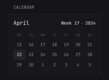
Display a calendar.
Example:
- type: calendar
Preview:
Note
There is currently no customizability available for the calendar. Extra features will be added in the future.
Markets
Display a list of markets, their current value, change for the day and a small 21d chart. Data is taken from Yahoo Finance.
Example:
- type: markets
  markets:
    - symbol: SPY
      name: S&P 500
    - symbol: BTC-USD
      name: Bitcoin
      chart-link: https://www.tradingview.com/chart/?symbol=INDEX:BTCUSD
    - symbol: NVDA
      name: NVIDIA
    - symbol: AAPL
      symbol-link: https://www.google.com/search?tbm=nws&q=apple
      name: Apple
Preview:
Properties
| Name | Type | Required |
|---|---|---|
| markets | array | yes |
| sort-by | string | no |
| style | string | no |
markets
An array of markets for which to display information about.
sort-by
By default the markets are displayed in the order they were defined. You can customize their ordering by setting the sort-by property to absolute-change for descending order based on the stock's absolute price change.
style
To make the widget scale appropriately in a full size column, set the style to the experimental dynamic-columns-experimental option.
Properties for each stock
| Name | Type | Required |
|---|---|---|
| symbol | string | yes |
| name | string | no |
| symbol-link | string | no |
| chart-link | string | no |
symbol
The symbol, as seen in Yahoo Finance.
name
The name that will be displayed under the symbol.
symbol-link
The link to go to when clicking on the symbol.
chart-link
The link to go to when clicking on the chart.
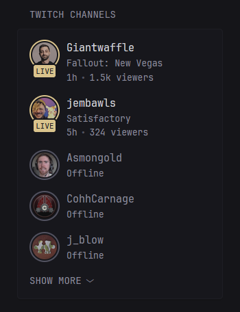
Twitch Channels
Display a list of channels from Twitch.
Example:
- type: twitch-channels
  channels:
    - jembawls
    - giantwaffle
    - asmongold
    - cohhcarnage
    - j_blow
    - xQc
Preview:
Properties
| Name | Type | Required | Default |
|---|---|---|---|
| channels | array | yes | |
| collapse-after | integer | no | 5 |
| sort-by | string | no | viewers |
channels
A list of channels to display.
collapse-after
How many channels are visible before the "SHOW MORE" button appears. Set to -1 to never collapse.
sort-by
Can be used to specify the order in which the channels are displayed. Possible values are viewers and live.
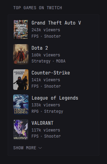
Twitch top games
Display a list of games with the most viewers on Twitch.
Example:
- type: twitch-top-games
  exclude:
    - just-chatting
    - pools-hot-tubs-and-beaches
    - music
    - art
    - asmr
Preview:
Properties
| Name | Type | Required | Default |
|---|---|---|---|
| exclude | array | no | |
| limit | integer | no | 10 |
| collapse-after | integer | no | 5 |
exclude
A list of categories that will never be shown. You must provide the slug found by clicking on the category and looking at the URL:
https://www.twitch.tv/directory/category/grand-theft-auto-v
                                         ^^^^^^^^^^^^^^^^^^
limit
The maximum number of games to show.
collapse-after
How many games are visible before the "SHOW MORE" button appears. Set to -1 to never collapse.
iframe
Embed an iframe as a widget.
Example:
- type: iframe
  source: <url>
  height: 400
Properties
| Name | Type | Required | Default |
|---|---|---|---|
| source | string | yes | |
| height | integer | no | 300 |
source
The source of the iframe.
height
The height of the iframe. The minimum allowed height is 50.
HTML
Embed any HTML.
Example:
- type: html
  source: |
    <p>Hello, <span class="color-primary">World</span>!</p>
Note the use of | after source:, this allows you to insert a multi-line string.

